Kindle paperwhite review
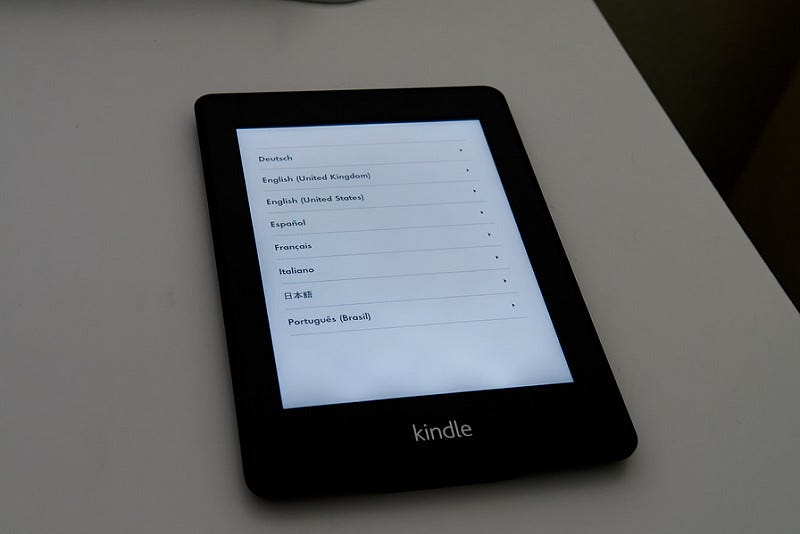
Setup screen has variety of languages in menu.
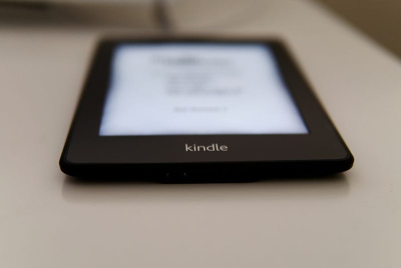
No home button.
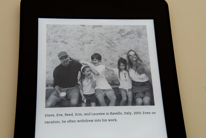
Much more crisp display.
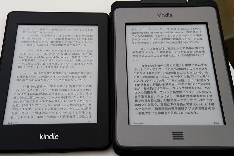
Compare with Kindle Touch with Lighted case
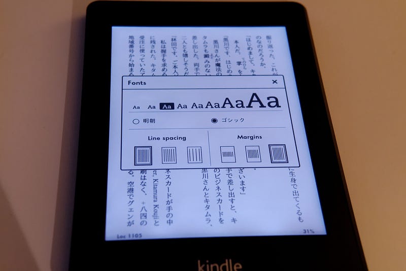
Japanese vertical mode (縦書) with KF8 MOBI is supported out of the box.
Hardware
- Definitely lighter, especially compared with Kindle Touch + lighted case
- No home button. Probably gets less confusing because I always click the home button when the device is off, which doesn’t do anything (have to power on, then click home)
- the light looks awesome in bed
- “8 weeks battery life with the light on” sounds like cheating when the light automatically turns off.
- Default Japanese mincho 明朝 font is kind of ugly. Had to switch to Gothic
- Text and images look much more dense, but somehow text looked better on Kindle Touch IMO
Software
- Unlocking from ads (special offers) now requires clicking the power key and swipe.
- No home button. Have to tap the tool bar area, then tap the software home. Hmm.
- Software is much snappier
- Supports Japanese vertical, top to bottom, right to left page turns and ruby.
- Default home screen is clumsy with ads and “Kindle top sellers”. Changed it to the listing mode already
- Line spacing is so dense even for the widest, but Kindle Touch had this issue as well.
- Probably has something to do with better pixel density, but Japanese fonts, especially Mincho look a bit pixelized. To my eyes fonts on Touch looked better. Overall, I love the updated device. It feels lighter, faster and the light doesn’t get annoying when reading in the dark. I miss some of the things from Touch like missing home keys, but i will probably get used to it.